Sketchbooks
My preferred list of sketchbooks readily available. There are many others but these are the ones I choose. Some better than others in terms of paper thickness, how they cope with ink, watercolour, glue, Selulotape, 2B pencil etc
Try a few out – you really can’t have enough sketchbooks, in fact I’ve started collecting them.
Seawhite of Brighton renowned for their well made hard backed sketchbooks – readily available
(Pity about their appalling website.)
A post like this obviously couldn’t possibly be complete without mention of Konigi’s Wireframe Sketchbook

Quite a bit of sketchbook porn at Fabriano
I can vouch for the quality – maybe something for the weekend 😉
Muji is always reliable in offering affordable and plenty of choice.
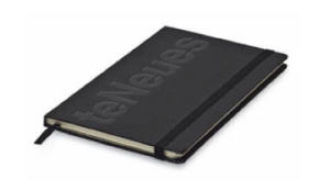
teNeues Slim Journals are a pleasant edition to the Moleskine-type notebook – cheaper too, if you can find them. (I got mine in a bookshop in Crystal Palace.)
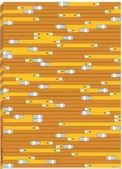
Pencils Sketchbook from We Are Family is very sweet – I got mine at the ICA in the Mall
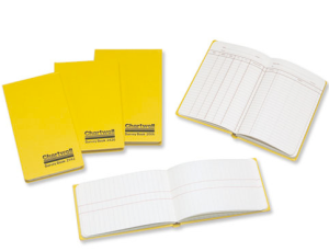
I also have a fondness for Chartwell Survey Stationary. Great for organising your boxes and arrows in all weathers. Available here
Action Book from Behance Outfiltter. Plenty of other stuff to choose from.
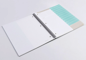
Rhodia offer good selection. I like the rise and fall variety.
Loads to choose from at the Design Museum Shop (and a good place to get your ODW (see below).
Other worthy mentions include this pocket calendar sketchbook and these two blog posts Sketching Tools and Piggyback Post: Sketching Tools
and no post on the subject of sketchbooks would be complete without mention of the Original Designers Workbook (ODW) – a great way to start any new project – and of course the Moleskine range
What a grid day
Yesterday was an excellent grid day. I discovered an excellent blog from Vladimir Carrer with a host of ideas around grids and layouts and handling typography – this one especially O rule + golden proportion for calculating the gutter in the grid
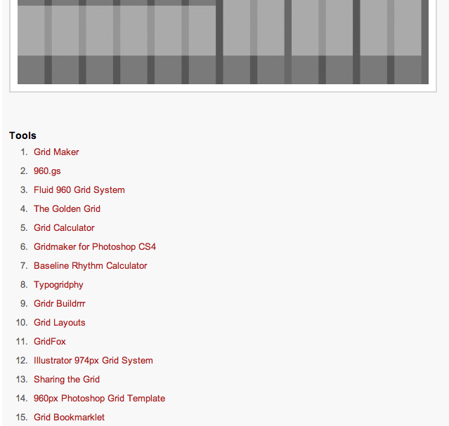
and then remembered this indescribably good roundup of grid tools and resources by Fuel Your Creativity Grid Based Design Toolbox.
Combine these two resources with The Grid System and inspiration like Information Architects and Mark Boulton Design and you should never find yourself stuck again.
Also check out this beta of the new Information Architects’ site
Further resource: 960 Grid System, Grid Systems – Making grids in Illustrator, The 1kb Grid System, Grid System Generator, Prototyping With The Grid 960 CSS Framework
Safari 4.0: better looking in beta
After downloading Safari 4, I am disappointed to see Apple not stick with some of the tab ideas they had in the Safari 4 beta. What they’ve returned to I find muddled and confusing. In the beta the tabs were above the address bar and this seemed quite radical for a number of people. I found it refreshing and ‘open’ – the pulling of tabs into new windows was clear and straightforward and the tools/arrows/buttons for adding a new tab, viewing the rest of your open tabs and viewing any other bookmarks in the bookmark bar were clearly positioned (see below). The beta, like Firefox, really felt like a ‘tool set’ rather than just a browser.
Now in the released version the tabs have come back to the traditional position and the position of the tools/arrows/buttons for adding a new tab, viewing the rest of your open tabs and viewing any other bookmarks in the bookmark bar are now close together, two with identical icon and, my small amount of testing, encourage mis-selection and confusion. And pulling a tab out into a window is not clear at all.
It would be interesting to know what occurred during any testing for Apple to step back from the some of the innovations of the beta.
Safari 4

Safari 4 beta

Online Form Innovation Awards
Last year I was moved to create the Online Form Innovation Awards after the experience of too many bad experiences and grave disappointments with online forms (the tip over the edge was an appallingly laid out Microsoft Word document masquerading as a form for another online innovation awards).
The fact is that this isn’t a rare occurrence – we come up against bad online (and offline) forms pretty much every day – a day doesn’t seem to go by without me noticing someone in my network Twittering a moan/frustration about a form. It’s shocking that so many of them are quite as bad as they are (irrespective of the efforts of form gurus like Luke Wroblewski and Caroline Jarrett).
Most websites, whether they be transactional, service or community contain some type of form that requires filling in either to receive a service, join up to the site or buy something. And time and time again users are confronted with difficult and complex forms that often give them no idea about their progress, feedback if something has gone wrong or even a little ‘form furniture’ to offer helpful links. These forms test resolve, infuriate and often have a significant and long-lasting detrimental effect on the associated brand or website.
So. Rather than be negative and create some celebration of the bad I thought it would be much better to invite a list of respected practitioners to judge and celebrate the best examples of the online form with the intention of creating a valuable resource centre for the many aspects, requirements, examples, best practices, and professional guidance for the online form.
The Online Form Innovation Awards have two purposes:
A to yearly hold an ‘Online Form Innovation Awards’ to highlight current innovation, style, usability, accessibility and strong conversion in online forms such as signup, application, or purchase.
B to build a reference library and forum of best practice for anyone online looking to understand, learn, discover, and share knowledge regarding the many variations of the online form.
The idea is to invite anyone to put forward or nominate any online form on their or any other website that they think deserves reference (ie signup, application, purchase) before a selection of judges with the intention of highlighting present innovation, style, usability, accessibility and strong conversion.
The judges in 2009 are a varied selection of web professionals, media consultants, online entrepreneurs and writers working in design, technology, theory, interaction, usability and accessibility:
Nico Macdonald writer, researcher and consultant working in media, technology and society. Spy
Lisa Halabi head of usability at Webcredible, one of the leading usability and accessibility consultancies in London. She’s a founding member of the UK Usability Professionals Association and an advocate for all things user-centered. She’s appeared on BBC Radio and ZD Net and contributes regularly to magazines like Marketing Week, Internet World, Computer Weekly, NMA and Travolution.
Richard Sedley Director of the cScape Customer Engagement Unit (CEU), a collective of online specialists drawn from multiple companies and offering clients a single source for the best in online marketing. Richard is also a columnist for Customer Magazine and Course Director in Social Media for the Chartered Institute of Marketing. In February 2008 he co-authored the book Winners and Losers in a Troubled Economy which looks at how companies can engage customers online to gain competitive advantage during a recession.
Luke Wroblewski Principal/Founder, LukeW Ideation & Design
Sid Yadav is a web entrepreneur based out of Queenstown, New Zealand. He is currently the co-founder and CEO of Nincha, a stealth startup, and creator of Memiary, an easy-to-use online pocket diary. Previously, Sid founded and edited Rev2.org, a blog covering web apps and services.
Oliver Reichenstein is a Swiss interaction designer living in Tokyo. iA
Caroline Jarratt is a usability consultant who specialises in forms, surveys, and tuning content of government and non-profit web sites. She is co-author of Forms that work: designing web forms for usability (foreword by Steve Krug). Effortmark
Joshua Kaufman is an interaction designer and user experience consultant living in San Francisco. He can be found at unraveled.
The first awards are open for entry now and will close on the 31 March 2009. The winners will be selected and notified on 24 April 2009. Rosenfeld Media have kindly supplied three copies of Luke Wroblewski’s book Filling in the Blanks to be given to three selected winners.
Please visit the site and make a suggestion. Feel free to make suggestions of further resources, links and relevant websites. If you would like to write something or offer up any research paper it would be gratefully received.
breadcrumb.me twitter | linkedin | friendfeed | flickr | last.fm | tumblr | wordpress | delicious | mybloglog | dopplr | google reader | dipity | slideshare
New Financial Times homepage
What does everyone think of the new ft.com homepage?
Dogs dinner?
Lacking authority?
Not thought through?
Text too big?
Text way too big?
Comical?
Embarrasing?
None of the above?
All of the above but worse?
Improved?
Focused?
Please add your thoughts
Axure RP Design Library
The excellent Luke Perman and Ian Fenn have put together what we’ve all been crying out for: an open Axure design library. They’ve made a really good start but it now requires the rest of the iA community to donate some input.
The Google group can be joined here as well as the design library

4 comments